01 / The Client
Sixty years of craft, presented like a supplier.
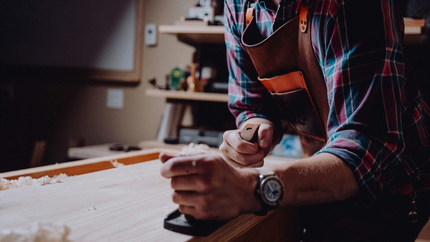
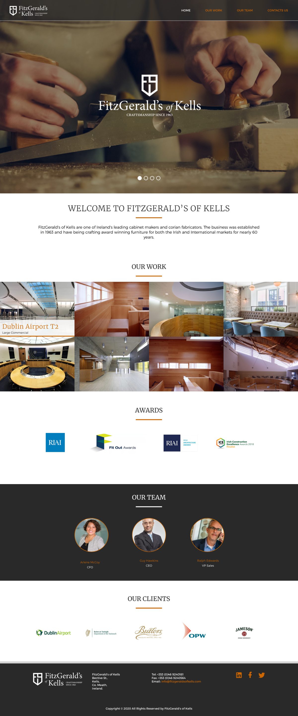
FitzGerald's of Kells have been making furniture since 1963 and are one of Ireland's leading cabinet makers and Corian fabricators, with award-winning work in both the Irish and international markets. Their reputation is built on precision and finish, and it travels almost entirely by word of mouth.
The problem was visibility, not quality. Anyone who had seen the workshop understood the standard immediately. Anyone meeting the brand for the first time, particularly an architect or specifier abroad, saw a trade supplier rather than a maker of considered, commissioned pieces.
“Take 50 years of tradition and make it modern, and at the same time be respectful of our heritage, history and craftsmanship.”
The client brief
02 / The Approach
Precision as the visual argument.
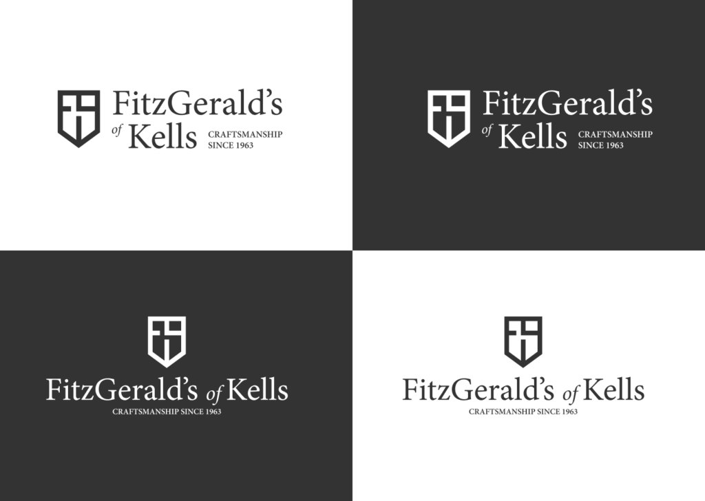
That brief set the tension deliberately: modern and traditional at once. Rather than resolving it with a compromise, I split the identity so each element carries one side of it. The logo device speaks to engineering and precision. The typography holds the heritage.
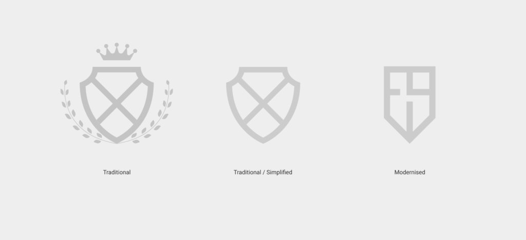
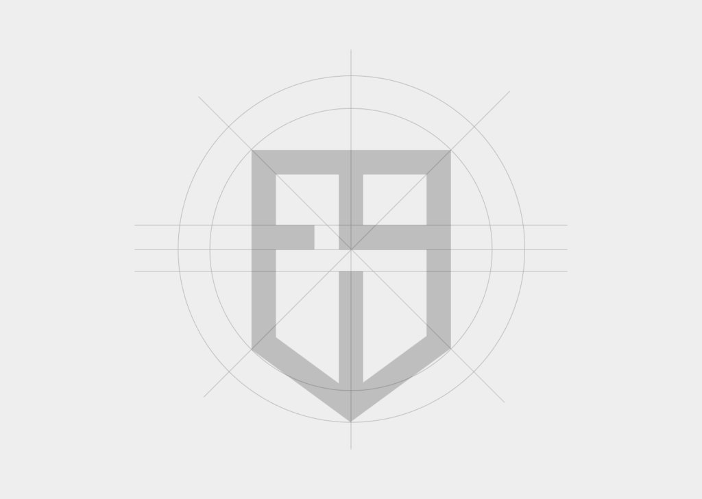
The device is drawn from the FitzGerald coat of arms, then reduced and re-cut so the geometry reads as engineered rather than illustrative. It is the family history stated in the language the work itself uses: clean lines, exact tolerances, nothing decorative that is not structural.
03 / Trade-offs
Restraint, so the work is the loudest thing.
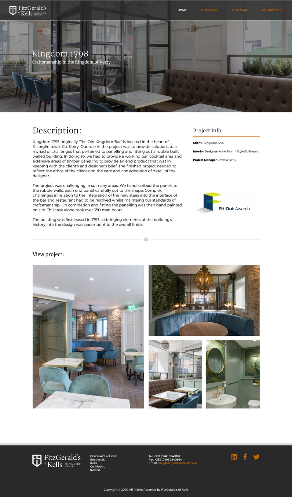
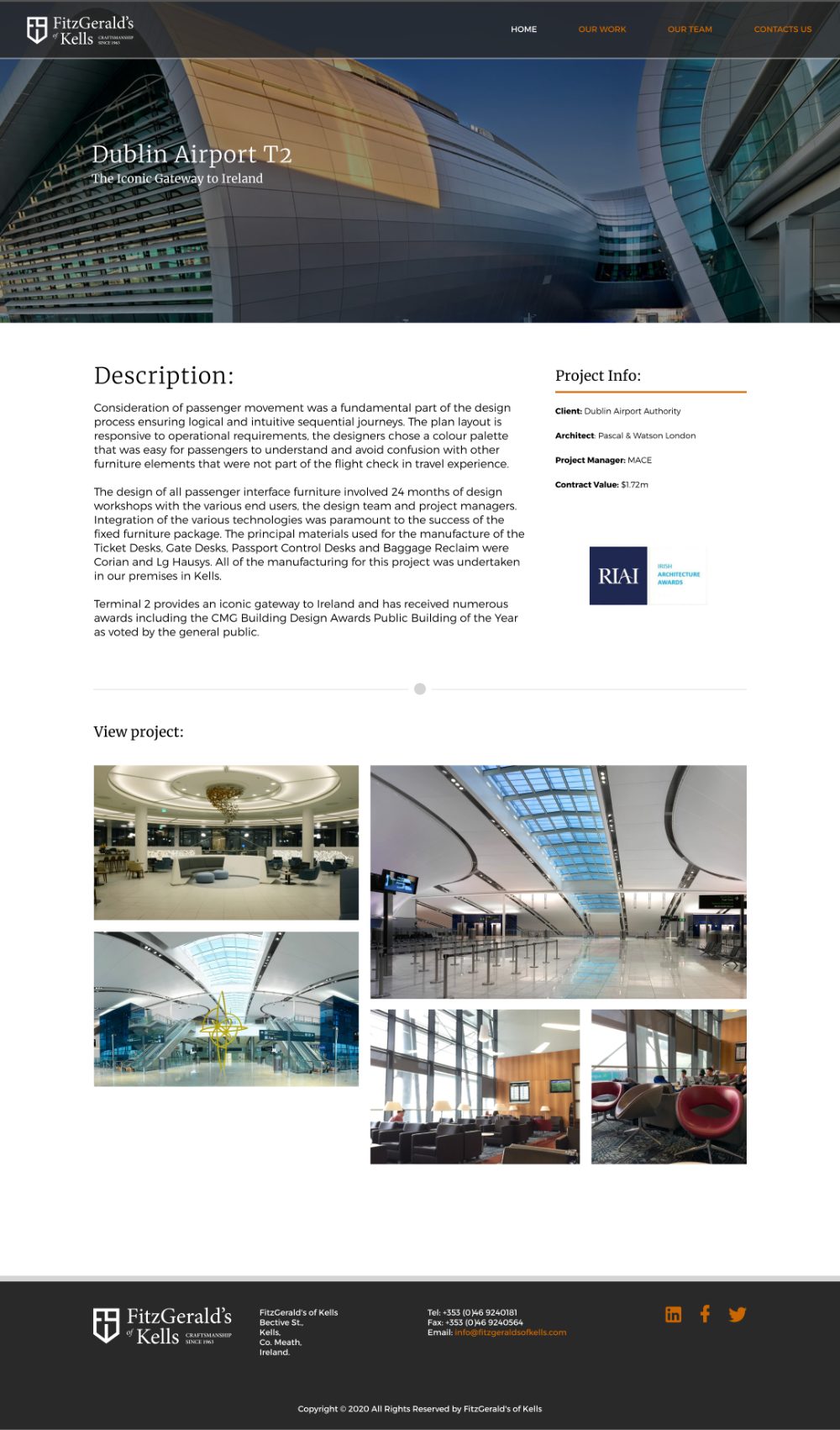
A deliberately limited palette was the single most consequential decision. Furniture photography is full of warm timber tones, stone, white Corian and shifting light. Any strong brand colour competes with the product.
The trade-off was a system that looks quiet in a presentation deck and correct in the wild. The brand recedes so the joinery does not have to fight it, which is the right priority for a maker whose portfolio is the sales argument.
04 / Outcome
An identity that reads as precise and made, and a site where six decades of work finally does the selling.